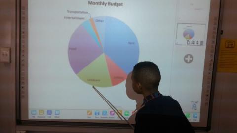
Learners had fun time learning about how data is represented using pie charts .They questioned why it's called a pie chart, "why not a pizza chart ?" , "because it looks like a pizza".
A Pie chart is (or a circle chart) a circular statistical graphic, which is divided into slices to illustrate numerical proportion. In a pie chart, the arc length of each slice (and consequently its central angle and area), is proportional to the quantity it represents. In other words; each pie slice is one value, and together they add up to something that makes sense. Learners drew pie charts to represent the estimated monthly budget for rent, transport and other things. They managed to read from the pie chart and answered questions pertaining to the different graphs.


